Data Visualization Using Tableau and D3

My data visualization class over the summer semester covered both Tableau and D3 from a technical standpoint, however it also really delved into the psychology of data visualization. I learned how the “gg” in “ggplot” (a common library used in both R and python) came from “Grammar of Graphics”. The first edition of this book appeared in 2000. This book has many ideas that are becoming more and more realized everyday through things like Excel, Tableau and other visualization software. I will treasure and look back fondly on the things that I learned in this course.
Tableau Visualization of CO2 by Country
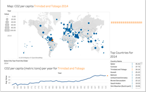
The dashboard I created shows the last 50 years of CO2 emissions per country across the world. The data is from the World Development Indicators Data.
View my work here:
D3 Dashboard using Pokémon Data
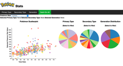
This was a fun dashboard to show off animations and interactions of elements in a D3 set of dashboards.
View my work here: